Creative Direction
Graphic Design
Authentic Polish kitchen in Austin, TX.
Classic dishes you’d have at home, drinks you’d have on an average night out, and classic not-too-sweet desserts. After hours, the space turns into a classy european-style night bar.
Brand Assets:

Polana: (feminine noun) translates to "glade" or "clearing" in English, referring to an open space in a forest or woodland.

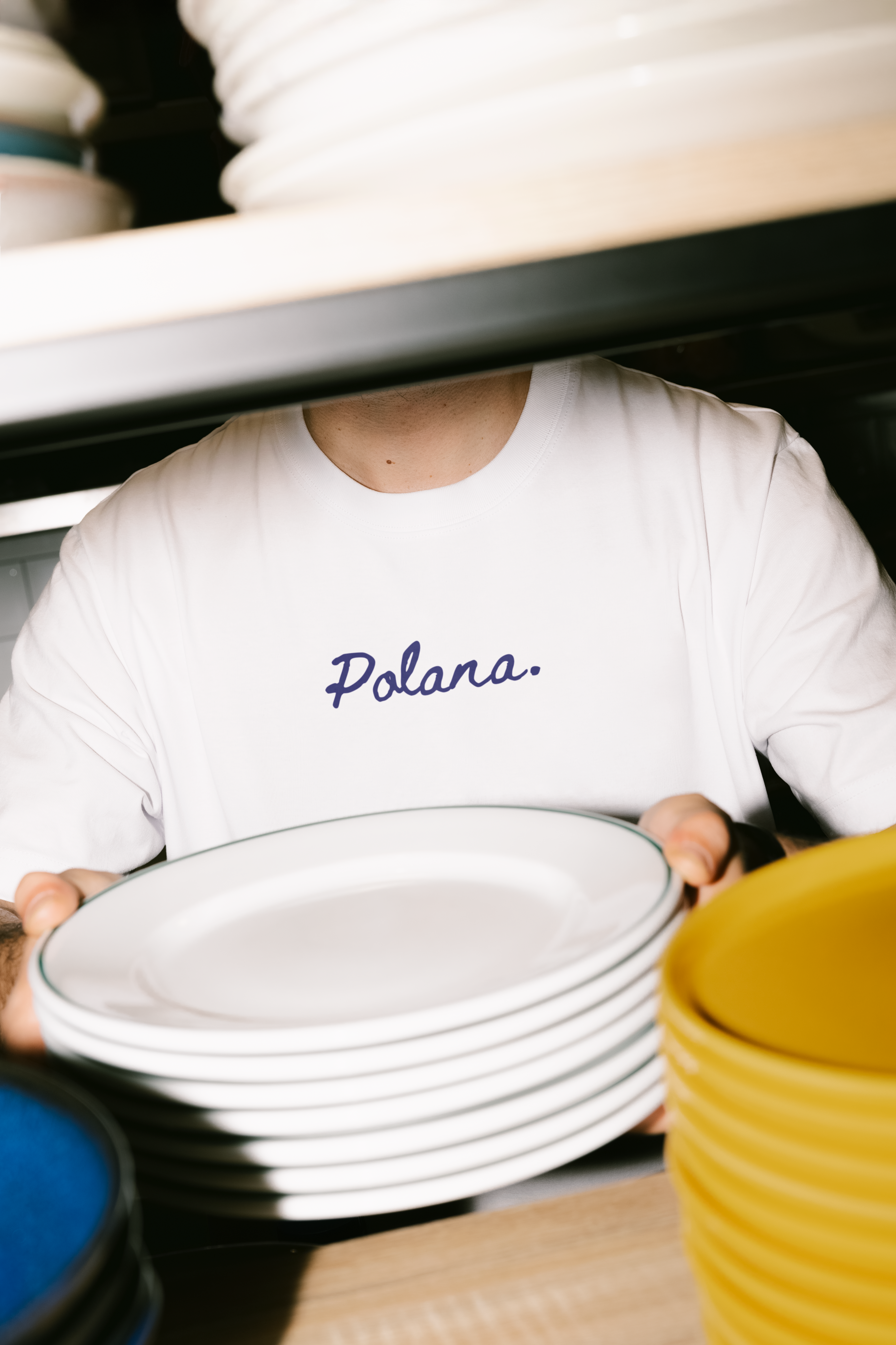
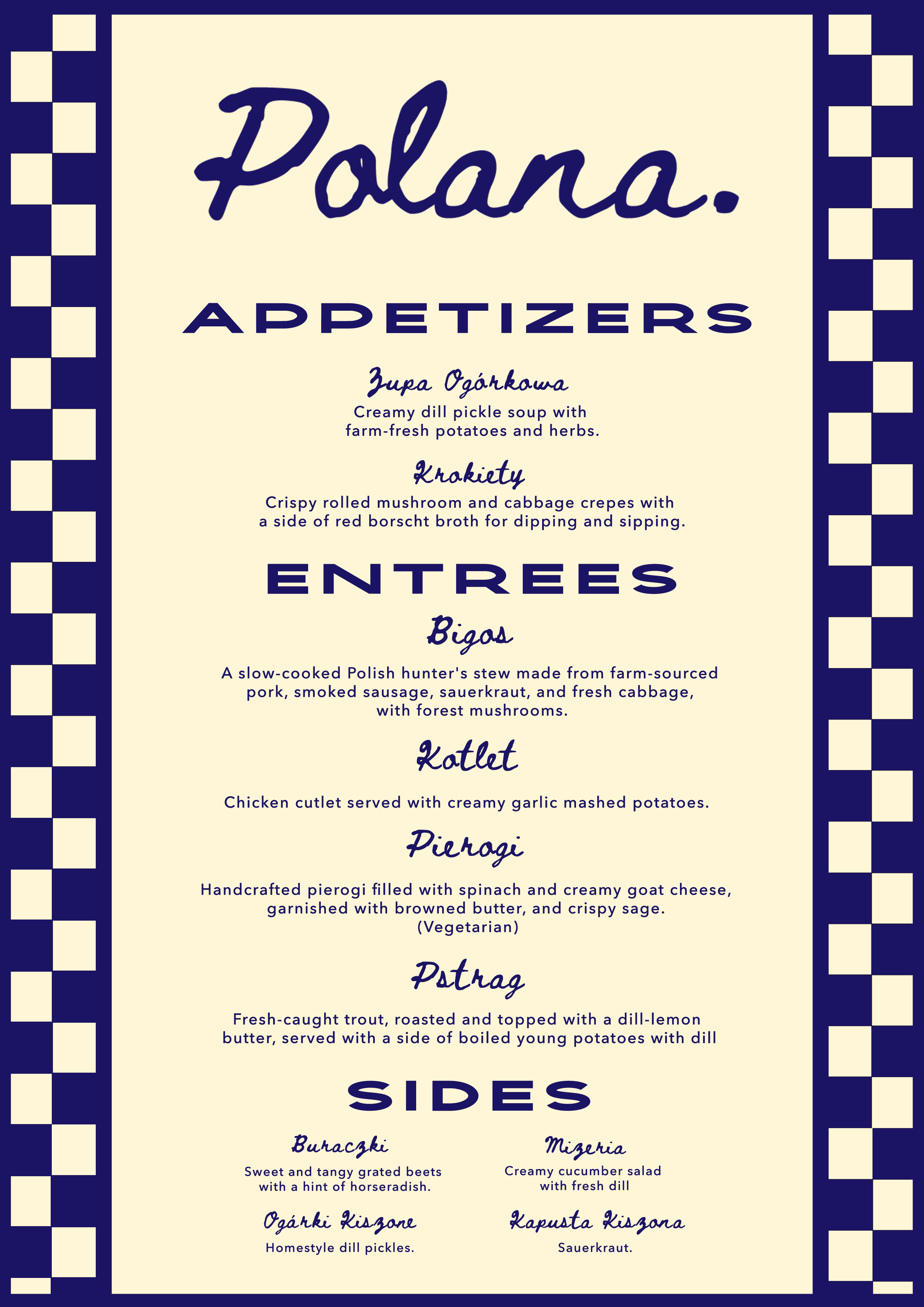
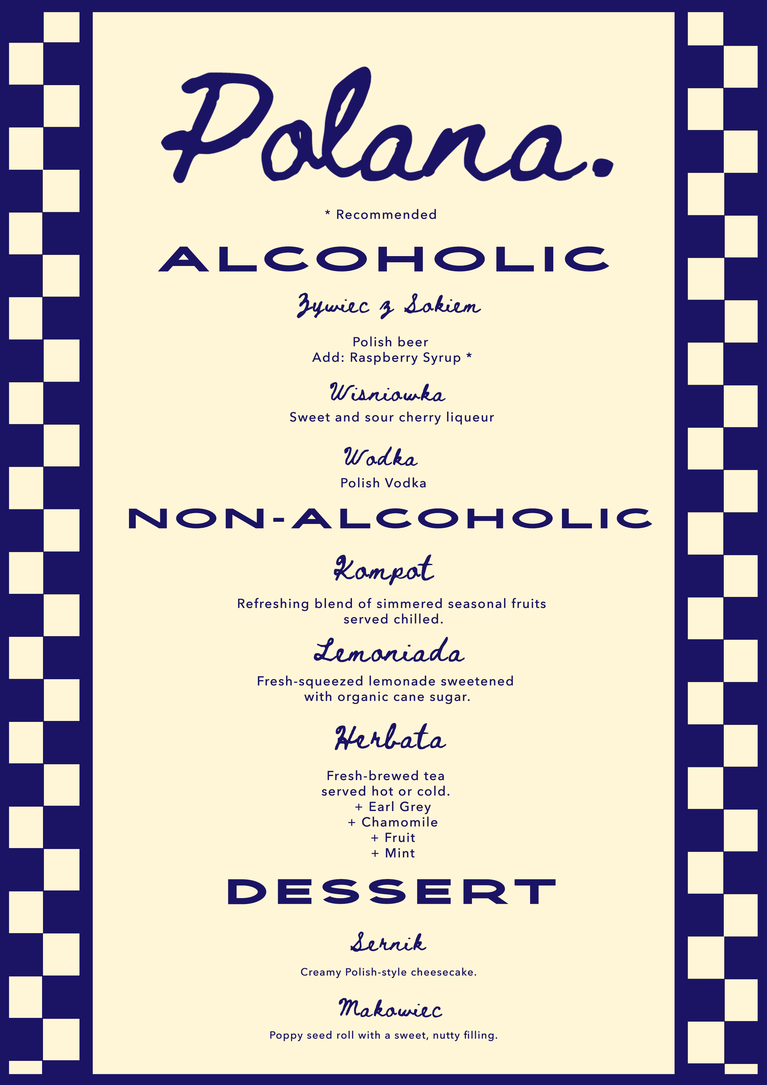
Utilizing cream and navy blue from classic colors used in traditional Polish cermics. Red as an accent color is an ode to the country’s flag, serving as a sybolism of the country’s freedom and independence. The logo design is simple and modern yet personal, tying in the traditional food with a modern twist. The menu design is inspired by classic diner-style menus, with checkered design and wide letttering. The graphics have a simple and modern approach while staying personable and approachable.
Menu:
The menu was specifically designed to evoke a homey, casual dining spot
![]()
![]()
![]()

Posters:
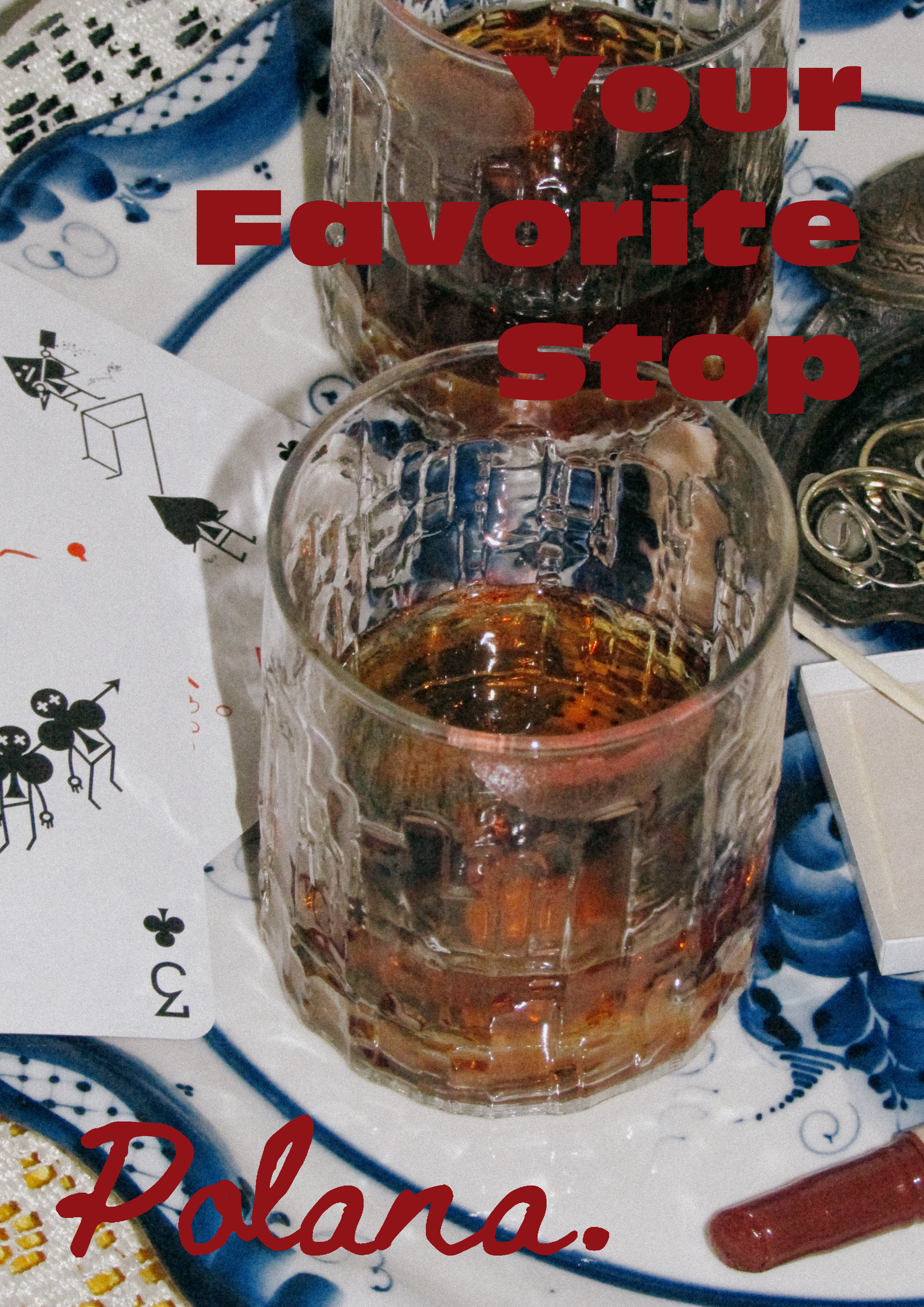
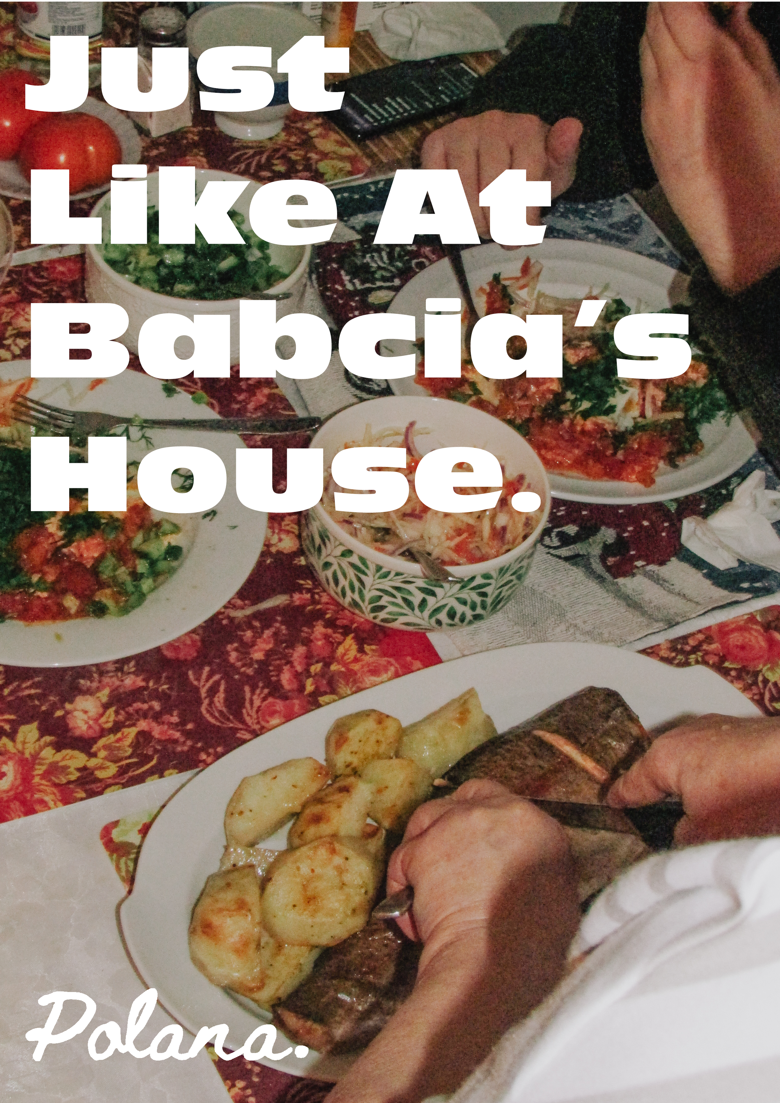
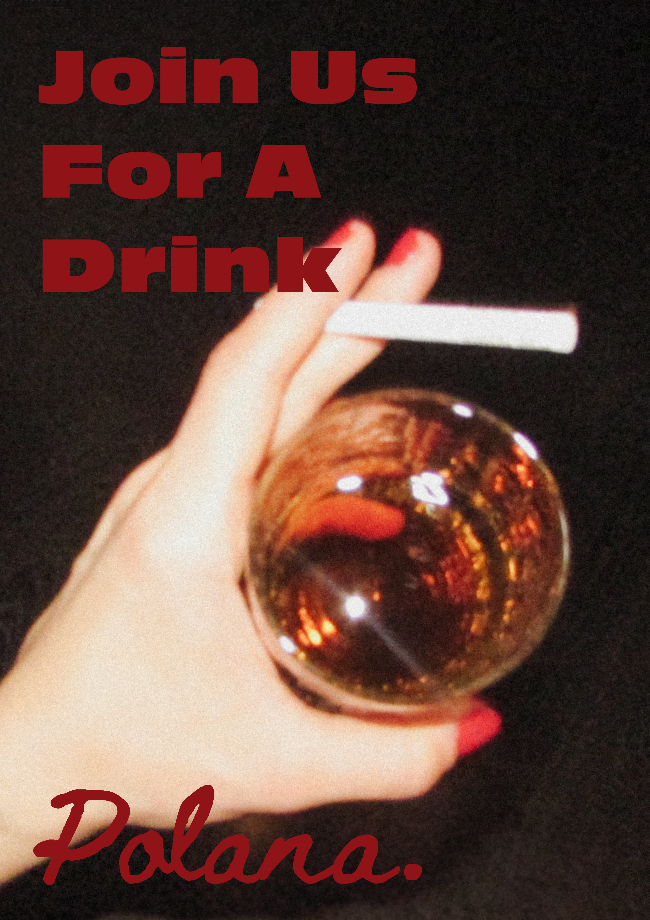
The marketing poster design is styled to advertise the Polana night bar.
The theme is classy maximalism. Think Slavic girl empties her purse on a gambling table. Pairing the modern logo with simplistic phrases juxtaposing maximalist images.
Photography: Sandra Braverman
More:
